务必下载!!
今日的代码和讲义 以及思维导图:【点击此链接下载 Day09.zip】
一. 绝对定位(absolute)
1.1. 绝对定位(重点)
1
2
3
4
5
6
7
8
9
10
11
12
13
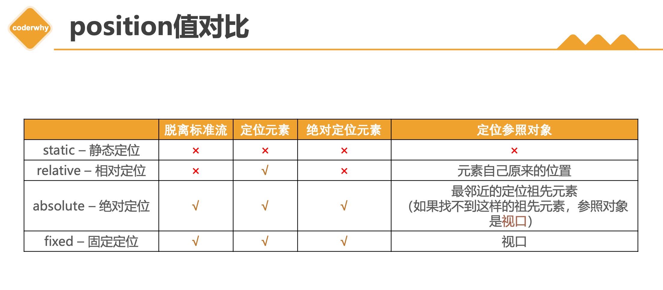
| 1.会脱离标准流
2.相对的参照对象
* 最近的祖先定位元素;
* 如果祖先元素都没有定位, 相对视口
3.子绝父相
* 子元素绝对定位
* 父元素相对定位
4.子绝父绝
* 子元素绝对定位
* 父元素绝对定位
5.子绝父固
* 子元素绝对定位
* 父元素固定定位
|
- 元素脱离
normal flow(脱离标准流、脱标)
- 可以通过
left、right、top、bottom进行定位
- 定位参照对象是最邻近的定位祖先元素
- 如果找不到这样的祖先元素,参照对象是视口
- 定位元素(
positioned element)
position值不为static的元素- 也就是
position值为relative、absolute、fixed的元素
子绝父相(了解)
- 在绝大数情况下,子元素的绝对定位都是相对于父元素进行定位
- 如果希望子元素相对于父元素进行定位,又不希望父元素脱标,常用解决方案是:
- 父元素设置
position: relative(让父元素成为定位元素,而且父元素不脱离标准流)
- 子元素设置
position: absolute
- 简称为“子绝父相”
- 当然,也有 子绝父绝 子绝父固 不要死记
1.2. position设置absolute/fixed特性
1
2
3
4
5
6
7
8
9
10
11
| 1.都是脱离标准流
2.可以任何设置宽度和高度
3.默认宽度高度是包裹内容
4.不再给父级元素汇报宽度和高度
5.自己内部依然按照标准流布局
6.公式
* 包含块的width = left + right + margin-left + margin-right + width
* left0 right0 margin 0 auto width: 200px -> 水平居中
* left 0 right 0 margin 0 -> 宽度沾满包含块的宽度
* 垂直方向也是一样
* 俺也一样
|
将position设置为absolute/fixed元素的特点
可以随意设置宽高
宽高默认由内容决定
不再受标准流的约束
- 不再
严格按照从上到下、从左到右排布
- 不再
严格区分块级(block)、行内级(inline),行内块级(inline-block)的很多特性都会消失
不再给父元素汇报宽高数据
脱标元素内部默认还是按照标准流布局
绝对定位元素(absolutely positioned element)
position值为absolute或者fixed的元素
对于绝对定位元素来说
- 定位参照对象的宽度 =
left + right + margin-left + margin-right + 绝对定位元素的实际占用宽度
- 定位参照对象的高度 =
top + bottom + margin-top + margin-bottom + 绝对定位元素的实际占用高度
如果希望绝对定位元素的宽高和定位参照对象一样,可以给绝对定位元素设置以下属性
left: 0、right: 0、top: 0、bottom: 0、margin:0
如果希望绝对定位元素在定位参照对象中居中显示,可以给绝对定位元素设置以下属性
left: 0、right: 0、top: 0、bottom: 0、margin: auto- 另外,还得
设置具体的宽高值(宽高小于定位参照对象的宽高)
auto到底是什么?
800 = 200 + ml0 + mr0 + 0 + 0auto -> 交给浏览器你来出来width: auto;- 1.行内非替换元素 ->
width: 包裹内容
- 2.块级元素 ->
width: 包含块的宽度
- 3.绝对定位元素 ->
width: 包裹内容
1.3. 绝对定位案例
1
2
3
4
| 网易云item的练习
* 基本布局
* 背景
* 绝对定位
|
- 这个案例看似简单, 但是里面涉及的知识点非常多
- 1.慢点做, 不要着急
- 2.如果有些东西做不出来, 去回顾之前的知识
- 3.多参考的代码
1
2
3
4
5
6
7
8
9
10
11
12
13
14
15
16
17
18
19
20
21
22
23
24
25
26
27
28
29
30
31
32
33
34
35
36
37
38
39
40
41
42
43
44
45
46
47
48
49
50
51
52
53
54
55
56
57
58
59
60
61
62
63
64
65
66
67
68
69
70
71
72
73
74
75
76
77
78
79
80
81
82
83
84
85
86
87
88
89
90
91
92
93
94
95
96
97
98
99
100
101
102
103
104
105
106
107
108
109
110
111
112
113
114
115
116
117
118
119
120
121
122
123
124
125
126
127
128
129
130
131
132
133
134
135
136
137
138
139
140
141
142
143
| <!DOCTYPE html>
<html lang="en">
<head>
<meta charset="UTF-8">
<meta http-equiv="X-UA-Compatible" content="IE=edge">
<meta name="viewport" content="width=device-width, initial-scale=1.0">
<title>Document</title>
<style>
a {
text-decoration: none;
color: #333;
}
.sprite_01 {
background-image: url(https://img.onmicrosoft.cn/micro-code-images/music_sprite_01.png);
display: inline-block;
}
.sprite_02 {
background-image: url(https://img.onmicrosoft.cn/micro-code-images/music_sprite_02.png);
display: inline-block;
}
.sprite_02_icon_music {
width: 14px;
height: 11px;
background-position: 0 -24px;
}
.sprite_02_icon_play {
width: 16px;
height: 17px;
background-position: 0 0;
}
.item {
width: 140px;
margin: 0 auto;
}
.item .top {
position: relative;
}
.item .top img {
vertical-align: top;
}
.item .top .cover {
position: absolute;
top: 0;
bottom: 0;
left: 0;
right: 0;
background-image: url(https://img.onmicrosoft.cn/micro-code-images/music_sprite_01.png);
background-position: 0 0;
}
.item .top .info {
position: absolute;
bottom: 0;
left: 0;
right: 0;
height: 27px;
padding-left: 10px;
line-height: 27px;
font-size: 12px;
color: #ccc;
background-image: url(https://img.onmicrosoft.cn/micro-code-images/music_sprite_01.png);
background-position: 0 -537px;
}
.item .top .info .icon-music {
position: relative;
top: 1px;
}
.item .top .info .count {
margin-left: 4px;
}
.item .top .info .icon-play {
position: absolute;
top: 0;
bottom: 0;
right: 10px;
margin: auto 0;
}
.item .bottom {
display: block;
margin-top: 8px;
font-size: 14px;
}
.item .bottom:hover {
text-decoration: underline;
}
</style>
</head>
<body>
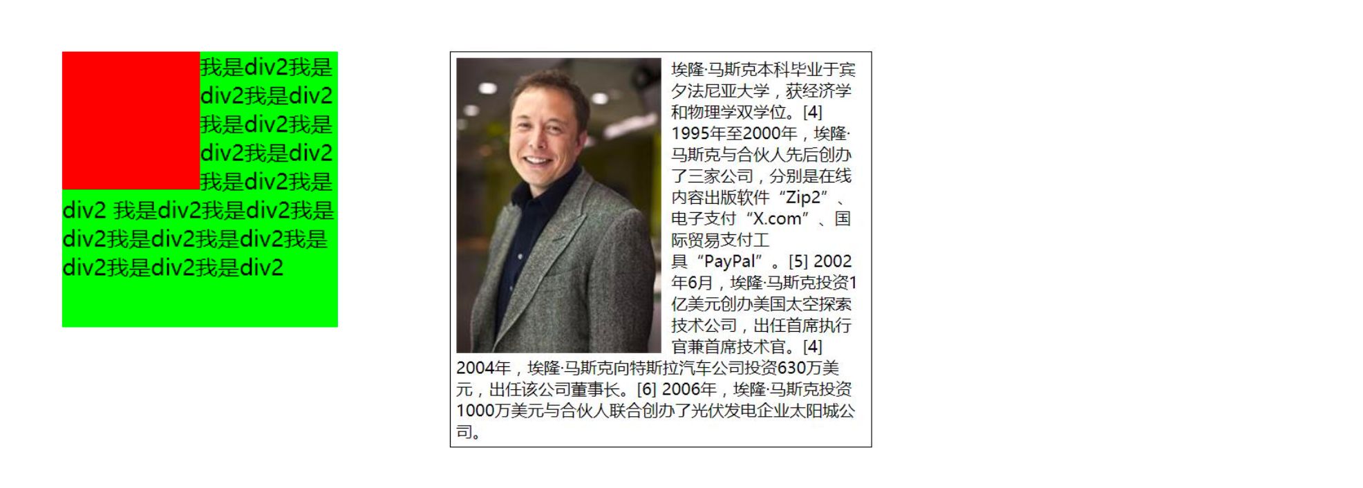
<div class="item">
<div class="top">
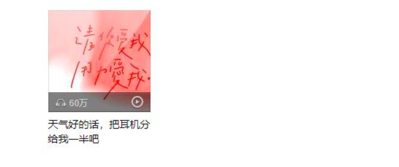
<img src="https://img.onmicrosoft.cn/micro-code-images/music_album01.jpg" alt="音乐封面">
<a class="cover" href="#"></a>
<div class="info">
<i class="sprite_02 sprite_02_icon_music icon-music"></i>
<span class="count">62万</span>
<i class="sprite_02 sprite_02_icon_play icon-play"></i>
</div>
</div>
<a class="bottom" href="#">
天气好的话,把耳机分给我一半吧
</a>
<i class="sprite_02 sprite_02_icon_play"></i>
<i class="sprite_02 sprite_02_icon_music"></i>
</div>
</body>
</html>
|
1.4. 粘性定位 sticky
1
2
3
4
5
| * 基本演练
* 默认相对定位
* top: 0 -> 固定(绝对)
* top/bottom/left/right -> 最近的滚动视口
|
- 另外还有一个定位的值是
position: sticky,比起其他定位值要新一些.
- sticky是一个大家期待已久的属性;
- 可以看做是
相对定位和固定(绝对)定位的结合体;
- 它允许被定位的元素
表现得像相对定位一样,直到它滚动到某个阈值点;
- 当
达到这个阈值点时, 就会变成固定(绝对)定位;
sticky是相对于最近的滚动祖先包含滚动视口的( the nearest ancestor scroll container’s scrollport )
1.5. position多个值总结
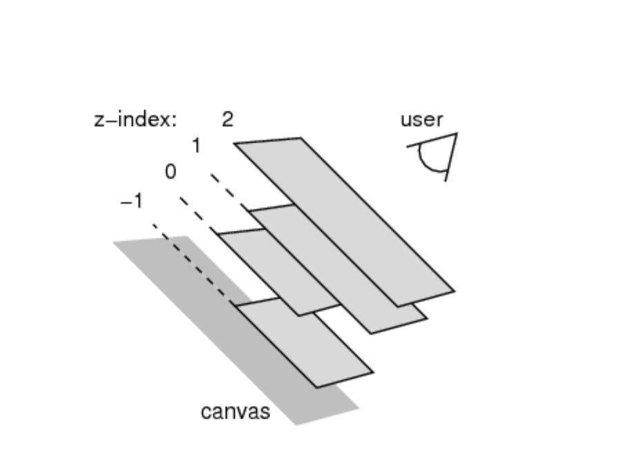
1.6. z-index
- z-index属性用来设置定位元素的层叠顺序(仅对定位元素有效)
- 比较原则
- 如果是
兄弟关系
- ✓
z-index越大,层叠在越上面
- ✓
z-index相等,写在后面的那个元素层叠在上面
- 如果
不是兄弟关系
- ✓ 各自
从元素自己以及祖先元素中,找出最邻近的2个定位元素进行比较
- ✓ 而且
这2个定位元素必须有设置z-index的具体数值
二. 浮动
2.1. 认识浮动
1
2
3
4
| float
* none
* left
* right
|
float 属性可以指定一个元素应沿其容器的左侧或右侧放置,允许文本和内联元素环绕它。
- float 属性最初只用于在一段文本内
浮动图像, 实现文字环绕的效果;
- 但是
早期的CSS标准中并没有提供好的左右布局方案, 因此在一段时间里面它成为网页多列布局的最常用工具;
- 绝对定位、浮动都会让元素脱离标准流,以达到灵活布局的效果
- 可以通过
float属性让元素产生浮动效果,float的常用取值
none:不浮动,默认值left:向左浮动right:向右浮动
2.2. 浮动规则
1
2
3
4
5
6
| * 规则一: 向左浮动或者向右浮动
* 规则二: 不能超出包含块;
* 规则三: 浮动元素不能层叠
* 规则四: 浮动元素会将行内级元素内容推出
* 图文环绕效果
* 规则五: 浮动只能左右浮动, 不能超出本行的高度
|
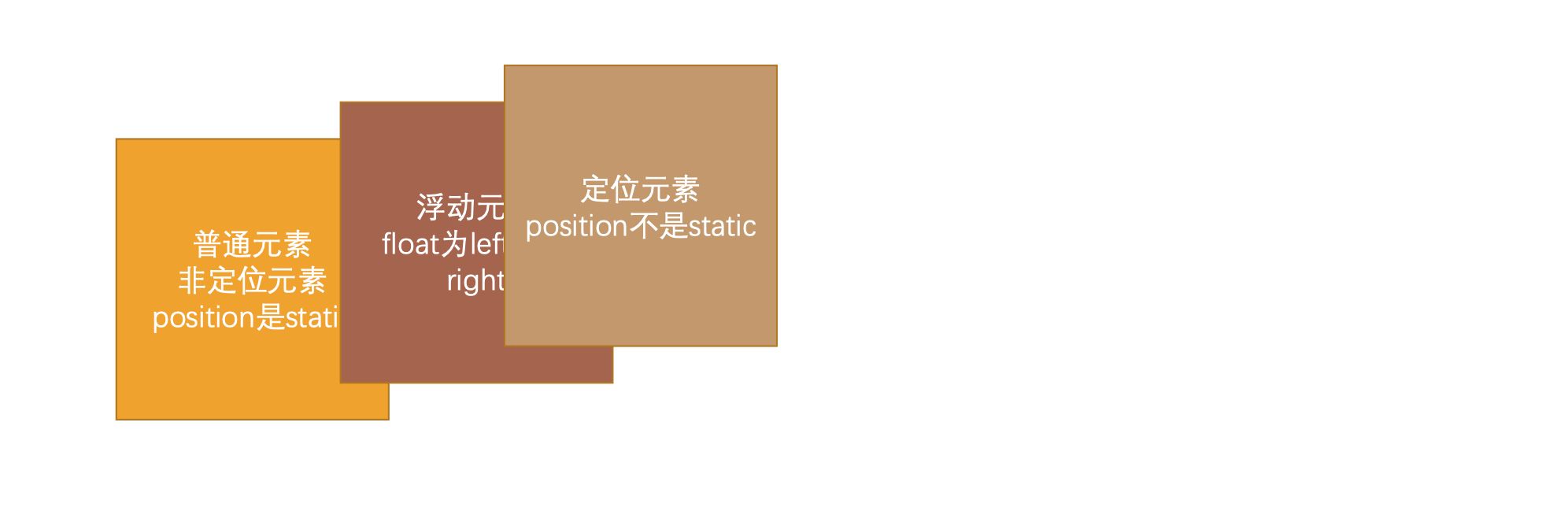
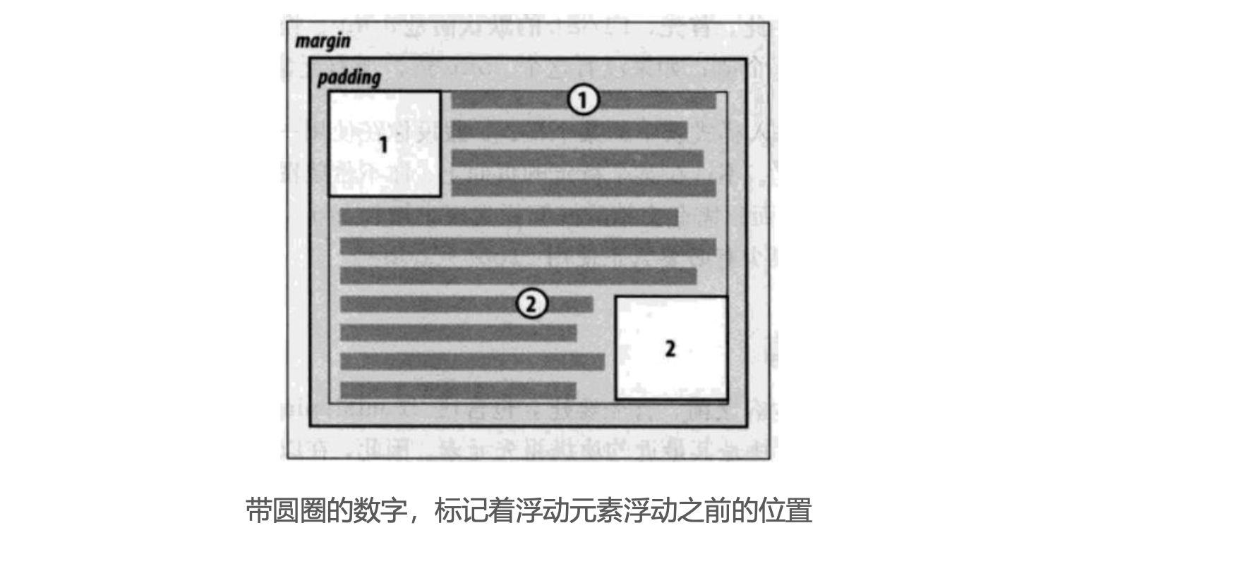
浮动规则一
- 元素一旦浮动后, 脱离标准流
朝着向左或向右方向移动,直到自己的边界紧贴着包含块(一般是父元素)或者其他浮动元素的边界为止定位元素会层叠在浮动元素上面
浮动规则二
- 如果元素是向左(右)浮动,浮动元素的左(右)边界不能超出
包含块的左(右)边界
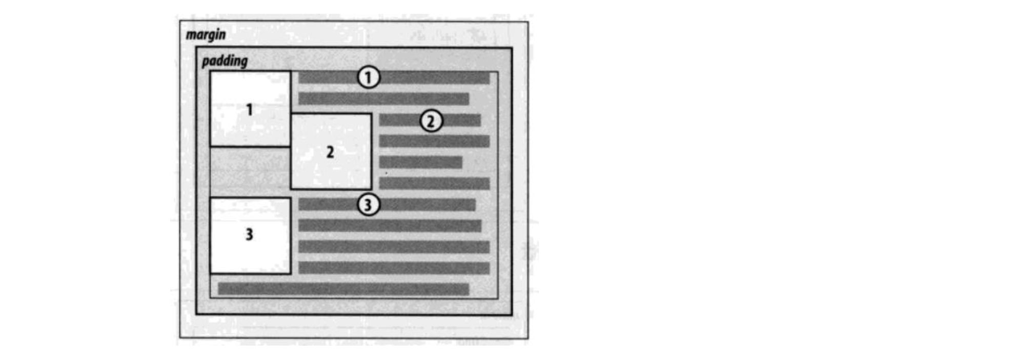
浮动规则三
- 规则三: 浮动元素之间不能层叠
- 如果一个元素浮动,另一个浮动元素已经在那个位置了,后浮动的元素将紧贴着前一个浮动元素(左浮找左浮,右浮找右浮)
- 如果水平方向剩余的空间不够显示浮动元素,浮动元素将向下移动,直到有充足的空间为止
浮动规则四
- 浮动元素不能与行内级内容层叠,行内级内容将会被浮动元素推出
- 比如
行内级元素、inline-block元素、块级元素的文字内容
浮动规则五
- 规则五: 行内级元素、inline-block元素浮动后,其顶部将与所在行的顶部对齐
2.3. 练习一 - 去除间隙
- 浮动常用的场景
- 解决行内级元素、inline-block元素的
水平间隙问题
1
2
3
4
5
6
7
8
9
10
11
12
13
14
15
16
17
18
19
20
21
22
23
24
25
26
27
28
29
30
31
32
33
| <!DOCTYPE html>
<html lang="en">
<head>
<meta charset="UTF-8">
<meta http-equiv="X-UA-Compatible" content="IE=edge">
<meta name="viewport" content="width=device-width, initial-scale=1.0">
<title>Document</title>
<style>
.box {
}
span {
background-color: orange;
}
</style>
</head>
<body>
<div class="box">
<span>aaa</span>
<span>bbb</span>
<span>ccc</span>
</div>
</body>
</html>
|
2.4. 练习二 - 百度页码
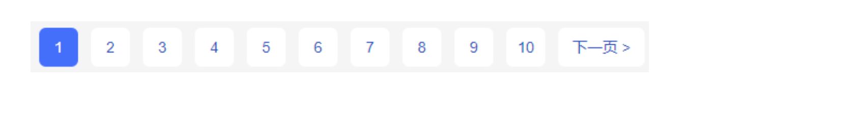
1
2
3
4
5
6
7
8
9
10
11
12
13
14
15
16
17
18
19
20
21
22
23
24
25
26
27
28
29
30
31
32
33
34
35
36
37
38
39
40
41
42
43
44
45
46
47
48
49
50
51
52
53
54
55
56
57
58
59
60
61
62
63
64
65
66
67
68
69
70
71
72
73
| <!DOCTYPE html>
<html lang="en">
<head>
<meta charset="UTF-8">
<meta http-equiv="X-UA-Compatible" content="IE=edge">
<meta name="viewport" content="width=device-width, initial-scale=1.0">
<title>Document</title>
<style>
ul, li {
list-style: none;
padding: 0;
margin: 0;
}
a {
text-decoration: none;
color: #333;
}
body {
background-color: #f2f2f2;
}
ul > li {
float: left;
margin-left: 12px;
}
ul > li > a {
display: inline-block;
width: 36px;
height: 36px;
text-align: center;
line-height: 36px;
border-radius: 6px;
background-color: #fff;
color: #3951b3;
font-size: 14px;
}
ul > li > a:hover, ul > li.active > a {
background-color: blue;
color: #fff;
}
ul > li.next > a {
width: 80px;
}
</style>
</head>
<body>
<ul>
<li class="item"><a href="#">1</a></li>
<li class="item"><a href="#">2</a></li>
<li class="item"><a href="#">3</a></li>
<li class="item"><a href="#">4</a></li>
<li class="item active"><a href="#">5</a></li>
<li class="item"><a href="#">6</a></li>
<li class="item"><a href="#">7</a></li>
<li class="item"><a href="#">8</a></li>
<li class="item"><a href="#">9</a></li>
<li class="item"><a href="#">10</a></li>
<li class="item next"><a href="#">下一页 ></a></li>
</ul>
</body>
</html>
|
2.5. 练习三 - 京东多列布局
- 浮动布局方案:
- 这个注意听,讲到了
负margin
1
2
3
4
5
6
7
8
9
10
11
12
13
14
15
16
17
18
19
20
21
22
23
24
25
26
27
28
29
30
31
32
33
34
35
36
37
38
39
40
41
42
43
44
45
46
47
48
49
50
51
52
53
54
55
56
57
58
59
60
| <!DOCTYPE html>
<html lang="en">
<head>
<meta charset="UTF-8">
<meta http-equiv="X-UA-Compatible" content="IE=edge">
<meta name="viewport" content="width=device-width, initial-scale=1.0">
<title>Document</title>
<style>
.content {
width: 1190px;
margin: 0 auto;
background-color: orange;
height: 800px;
}
.box {
margin-right: -10px;
}
.item {
width: 230px;
height: 322px;
background-color: purple;
color: #fff;
float: left;
margin-right: 10px;
}
</style>
</head>
<body>
<div class="content">
<div class="box">
<div class="item item1">1</div>
<div class="item item2">2</div>
<div class="item item3">3</div>
<div class="item item4">4</div>
<div class="item item5">5</div>
</div>
</div>
</body>
</html>
|